The modern workplace is undergoing a transformation, with businesses increasingly recognising that employee well-being is not merely a tick-box exercise but a fundamental pillar of success. Amidst discussions of flexible working patterns, ergonomic furniture, and mental health support, one element often remains underestimated: the power of colour. The shades that envelop us in our daily professional lives can subtly yet profoundly influence our mood, focus, and overall sense of contentment. As organisations seek to cultivate environments where teams thrive, understanding and applying colour psychology has emerged as an accessible and impactful strategy. From calming zen-inspired palettes to energising feature walls, the thoughtful application of paint can reshape how employees experience their workspace.
Understanding Colour Psychology in the Workplace
The science behind how colours affect mood and productivity
Colour psychology delves into the fascinating interplay between hues and human behaviour, revealing that our surroundings do far more than merely provide a backdrop to our activities. Research has consistently demonstrated that colours trigger specific psychological and emotional responses, influencing everything from heart rate to cognitive performance. For instance, blue tones have been shown to lower heart rate and blood pressure, fostering a sense of calm that can enhance concentration and problem-solving abilities. This makes blue an all-round winner for environments where focus and mental clarity are paramount, such as accounting departments or technology teams.
Green, closely associated with nature, promotes balance and reduces stress levels, making it an excellent choice for teams engaged in long hours of demanding work. Studies from Lund University highlight that colours send impulses to the brain that directly affect our behaviour and well-being, underscoring the physiological dimension of workplace design. Meanwhile, yellow is celebrated for its capacity to spark creativity and optimism, ideal for brainstorming rooms and creative agencies. Red, though stimulating and energising, requires careful application; it can increase heart rate and promote urgency, but excessive use may lead to heightened anxiety or even headaches. Neutrals such as beige, grey, and white offer professionalism and versatility, yet research from the University of Texas warns that overly bland colour schemes can contribute to feelings of sadness and diminished productivity.
Why traditional office colour schemes may be holding your team back
For decades, corporate environments have defaulted to safe, muted palettes dominated by whites, greys, and beiges. While these neutral tones provide a clean and professional aesthetic, they can inadvertently create uninspiring atmospheres that fail to engage employees emotionally or mentally. The notion that a one-size-fits-all approach to office colour psychology suffices is increasingly outdated, as evidence mounts that drab environments contribute to lower morale and reduced cognitive performance. Unproductive workplaces are estimated to cost UK businesses a staggering sum annually, and while many factors contribute to this figure, the physical environment plays a non-negligible role.
The challenge lies in recognising that different tasks and team functions demand different psychological states. A monotonous colour scheme applied uniformly across an office overlooks the nuanced needs of various work activities. For example, employees engaged in detail-oriented tasks may benefit from the stimulating qualities of red, while those requiring sustained concentration might thrive in calming blue or green surroundings. By clinging to traditional, overly cautious colour choices, organisations risk missing out on the tangible benefits that strategic colour application can deliver, from enhanced mood and motivation to measurable improvements in productivity.
Applying feng shui principles to office design
Balancing energy flow with strategic colour placement
Feng Shui, an ancient Chinese philosophy, offers valuable insights into how spatial arrangements and colour choices can influence energy flow, or chi, within a space. At its core, Feng Shui seeks to create harmony between individuals and their environments, a principle that translates remarkably well to modern office design. In the context of workplace colour psychology, Feng Shui encourages the use of soft, muted tones to promote relaxation and concentration, while brighter shades can inject vitality and creativity into collaborative zones. The strategic placement of colours becomes a deliberate act of balancing these energies, ensuring that each area of the office supports the activities it hosts.
For instance, incorporating calming blues and greens in quiet zones or focus areas aligns with Feng Shui's emphasis on tranquillity and mental clarity. These hues not only reduce stress but also foster an environment conducive to deep work and problem-solving. Conversely, collaborative spaces can benefit from warmer tones such as yellows and oranges, which stimulate enthusiasm and mental stimulation without overwhelming the senses. Purple, often associated with loyalty and luxury, can add a touch of sophistication to executive suites or client-facing areas. The goal is to create a holistic environment where colours work in concert to support the natural rhythm of the workday, enhancing both individual and collective performance.
Creating harmony between calming tones and energising accents
Achieving balance in office design requires more than simply selecting a handful of colours; it demands a thoughtful integration of calming tones and energising accents to create a harmonious workspace. The interplay between these elements can transform a functional office into a space that actively contributes to employee wellbeing and productivity. Calming tones such as soft blues, greens, and lavenders provide a stable foundation, promoting relaxation and reducing anxiety. These shades are particularly effective in areas where employees need to concentrate for extended periods, such as individual workstations or quiet rooms.
However, an entirely subdued palette risks creating a lifeless atmosphere, which is where energising accents come into play. Bold feature walls in vibrant yellows, reds, or even deep purples can inject personality and energy into social spaces, breakout areas, or conference rooms. These accents serve as visual stimuli that invigorate the mind and encourage interaction, making them ideal for collaborative spaces where innovation and teamwork are paramount. The key lies in restraint and intentionality; too much of a bold colour can overwhelm and induce stress, while too little may fail to make an impact. By balancing calming and energising elements, designers can craft environments that feel both restful and dynamic, supporting a diverse range of activities and emotional states throughout the workday.
Selecting colours for different workspace zones
Best Paint Choices for Focus Areas and Quiet Zones
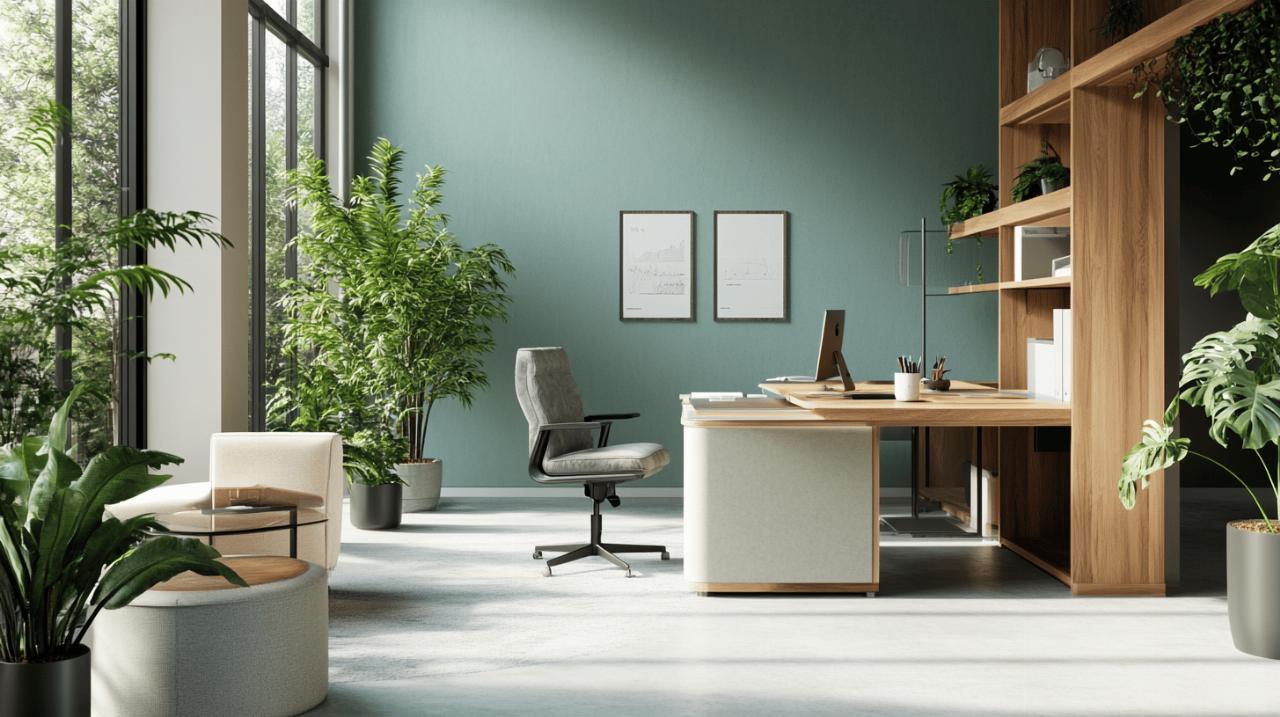
 Workspace zones dedicated to focus and quiet contemplation demand colours that enhance concentration and minimise distractions. Blue emerges as a standout choice, particularly for teams engaged in analytical or technical work. Its ability to improve concentration and lower heart rate makes it especially beneficial for demanding jobs where sustained mental effort is required. However, it is crucial to select the correct shade; overly dark or cold blues can create a depressing atmosphere, so lighter, more balanced tones are often preferable. Testing samples in the actual space, considering the interaction with natural lighting, ensures the chosen hue achieves the desired effect.
Green, with its strong associations with nature and positive memories, is another excellent option for focus areas. It promotes calmness and reduces anxiety, supporting longer-term concentration without the risk of overstimulation. For workplaces prioritising eco-credentials or seeking to integrate biophilic design principles, green serves as a natural bridge between the indoor environment and the outside world. Lavender and other soft purples can create a restful atmosphere, making them suitable for conference rooms or quiet zones where employees retreat for contemplation or restorative breaks. When selecting paint for these areas, the overarching goal is to foster an environment where employees feel at ease yet mentally alert, enabling them to engage deeply with their tasks.
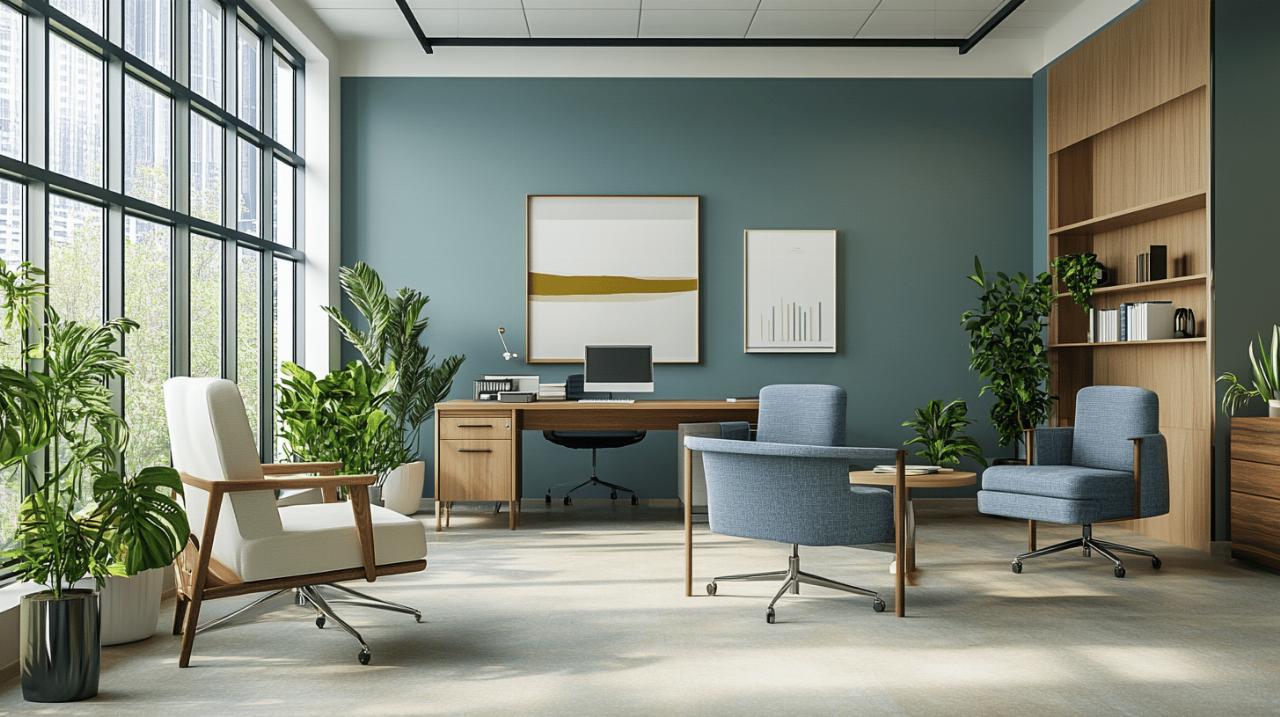
Energising collaborative spaces with bold feature walls
Collaborative spaces thrive on energy, creativity, and open communication, making them ideal candidates for bold colour interventions. Feature walls painted in vibrant yellows, reds, or even striking oranges can transform a mundane meeting room into a dynamic hub of innovation. Yellow, in particular, sparks creativity and enthusiasm, making it a natural fit for brainstorming rooms and creative agencies. Its optimistic qualities encourage team members to think outside the box and approach challenges with a fresh perspective. However, moderation is essential; overusing yellow can increase anxiety and appetite, so it is best applied as an accent rather than the dominant colour.
Red, with its capacity to drive energy and promote urgency, can be highly effective in collaborative spaces where action and decision-making are priorities. It increases heart rate and mental alertness, qualities that can galvanise a team during intense project phases. Yet, its stimulating properties mean it should be used sparingly to avoid inducing stress or discomfort. Pairing red accents with neutral tones or softer hues ensures the space remains balanced and welcoming. For organisations looking to convey personality and energy, bold, bright colours can make a powerful statement, reflecting a brand identity that values innovation and dynamism. Meanwhile, spaces designed for more relaxed collaboration might benefit from muted pastels or natural tones, promoting calm and restoration while still encouraging interaction and teamwork.
Implementing a comprehensive well-being strategy through design
Combining Colour with Lighting and Ergonomics for Maximum Impact
While colour is a potent tool in shaping workplace environments, it is most effective when integrated into a broader well-being strategy that encompasses lighting, ergonomics, and spatial design. Natural lighting interaction, for instance, dramatically alters how colours are perceived throughout the day. A shade that appears calming under morning sunlight may feel stark or cold under artificial lighting in the evening. Therefore, assessing how chosen colours respond to varying light conditions is a critical step in the design process. This consideration ensures that the environment remains supportive and conducive to productivity regardless of the time of day.
Ergonomics, too, plays a vital role in employee wellbeing. Office furniture selection should complement the colour scheme, creating a cohesive visual and functional experience. Accessories and furniture in colours that echo or contrast with wall tones can enhance the overall aesthetic while promoting comfort and efficiency. Acoustic treatments, often overlooked, further contribute to a holistic environment by reducing noise pollution, which can undermine even the most thoughtfully designed colour schemes. By addressing the physical, emotional, and mental needs of employees through a comprehensive approach, organisations demonstrate a commitment to creating spaces where people genuinely want to be.
Measuring the Return on Investment in Employee-Centred Design
Investing in employee-centred design, including strategic colour application, is not merely an aesthetic or ethical choice; it is a sound business decision with measurable returns. Research suggests that employees working in well-designed, colour-optimised environments may experience up to a 15 per cent increase in productivity. This uplift, combined with improvements in morale, creativity, and stress reduction, can translate into significant cost savings and competitive advantages. The average Brit spends over 84,000 hours at work in their lifetime, a staggering figure that underscores the importance of creating environments that support long-term wellbeing and performance.
Measuring the return on investment involves both quantitative and qualitative assessments. Surveys and feedback mechanisms can gauge employee satisfaction and perceived improvements in mood and focus, while productivity metrics and absenteeism rates offer concrete data on the impact of design interventions. Workplace analysis processes, which examine how employees interact with their environment, provide valuable insights into which activities benefit most from specific colour psychology approaches. By demonstrating the tangible benefits of thoughtful design, organisations can justify the upfront costs of office refurbishment and position themselves as employers of choice in an increasingly competitive talent market. Ultimately, investing in the physical workspace is an investment in the people who inhabit it, fostering a culture of care and respect that resonates far beyond the walls of the office.